Bosco Pasta
Art Direction
Packaging
Branding
Collateral
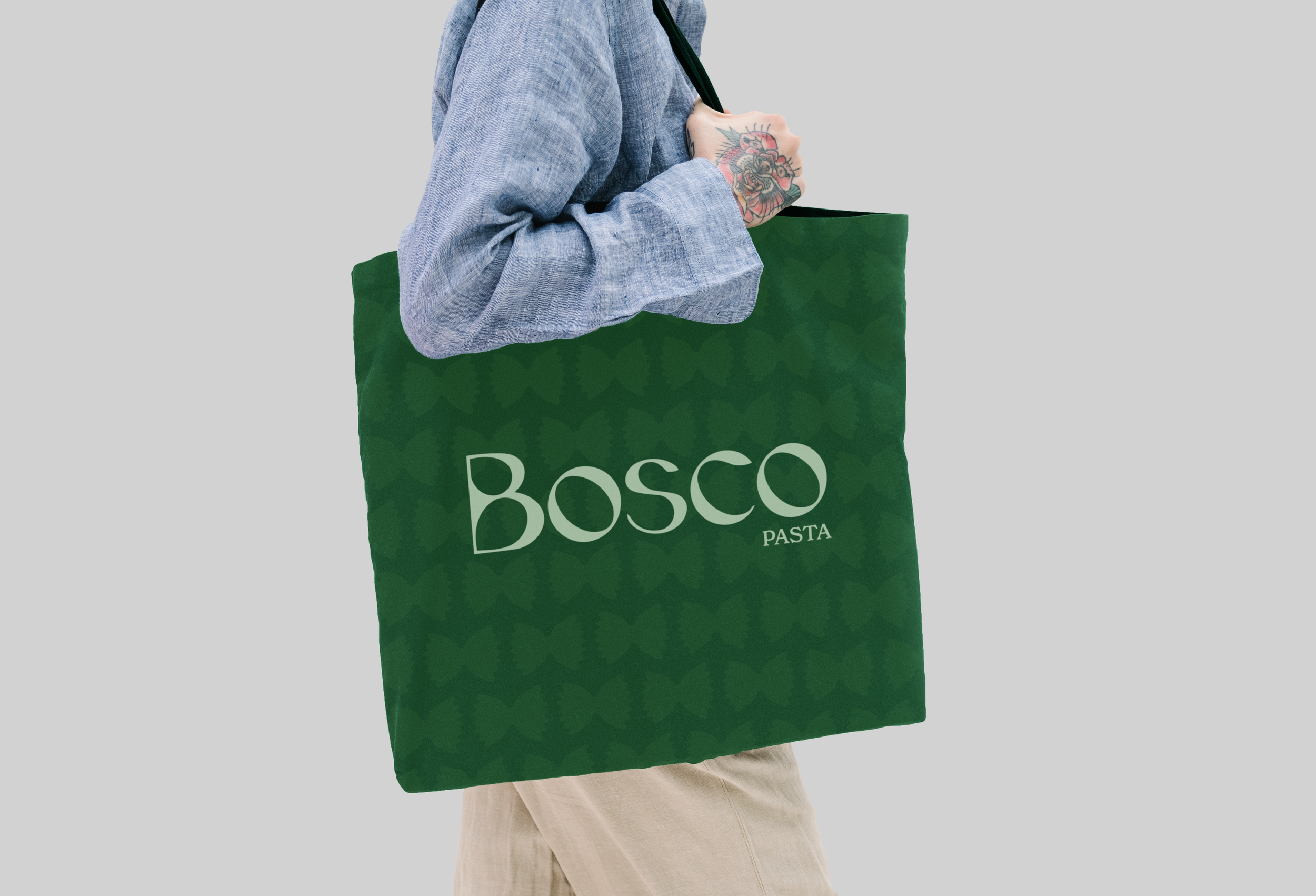
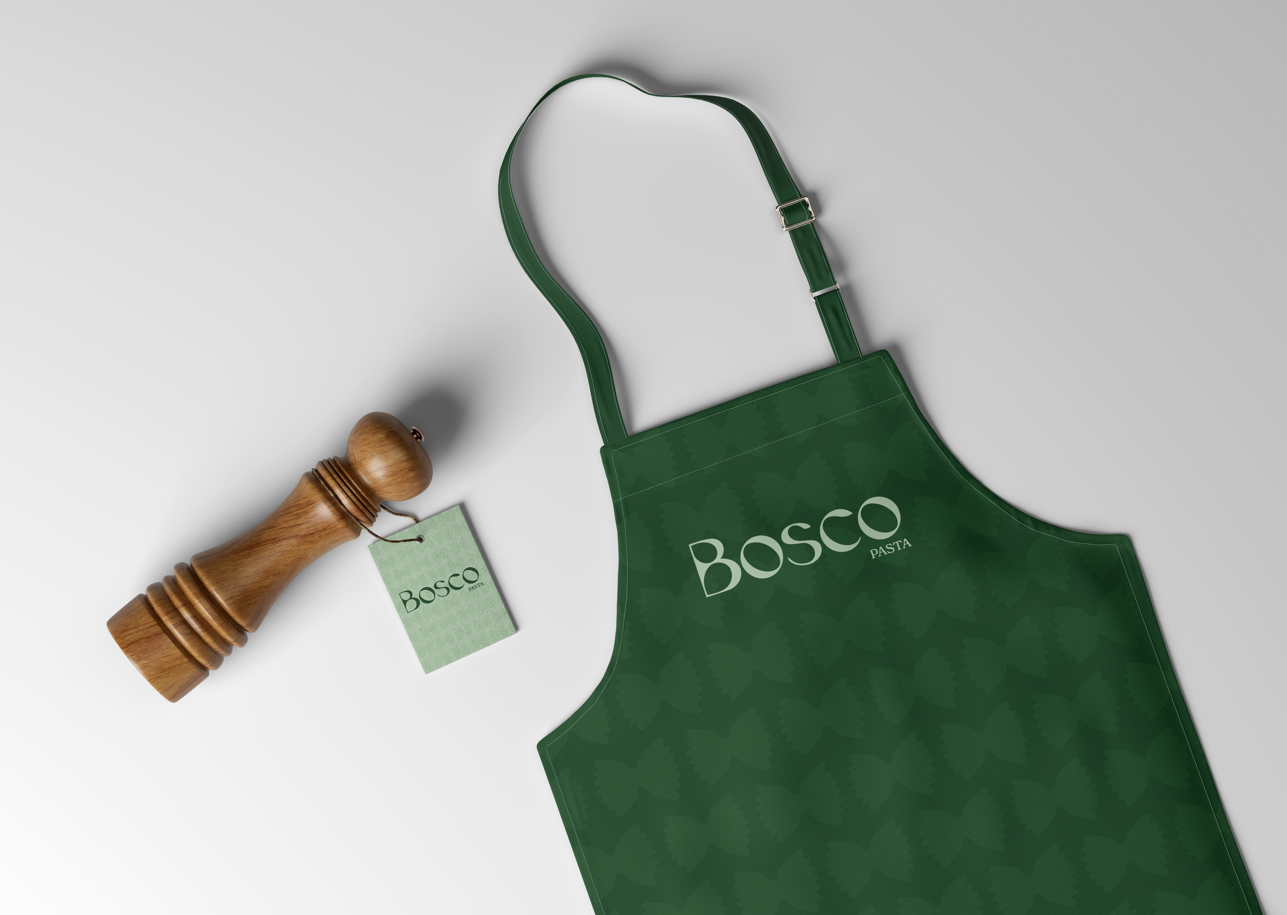
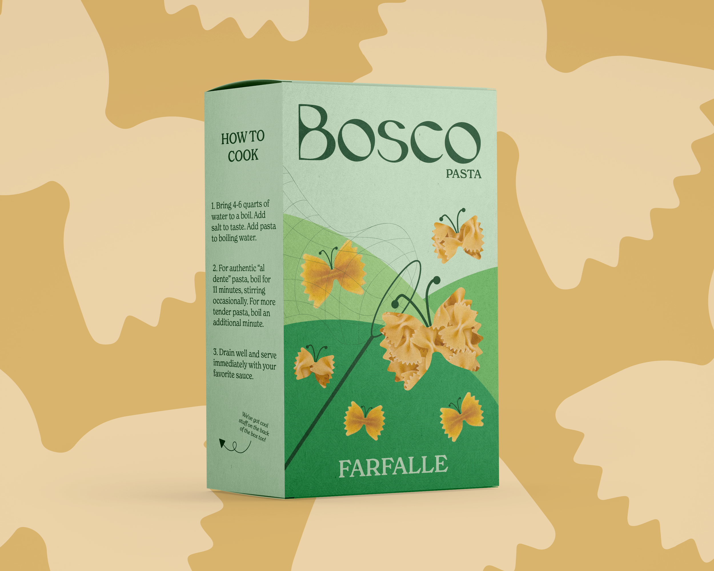
Bosco Pasta is a pasta brand that highlights the many unique pasta shapes available to us, and the origin of their names. For this project, I chose to focus on one of my favorite pasta shapes: farfalle. I had always called it bowtie pasta growing up, but during my research I was surprised to learn it actually means butterfly, which served as the main inspiration for this design. I chose a green color palette because of its association with nature, and because I noticed that most pasta brands use blues and reds, so the green would stand out nicely against the competition.